

Building a website on a lean budget is no longer unusual. Thousands of business owners, freelancers, and creators assemble professional sites every day without spending a fraction of what an agency would charge.
The aspiration, however, never shrinks to match the budget. You still want a site that looks credible, polished, and visually mature. The question is how to achieve that without dramatically increasing your spend.
One design choice accomplishes more than nearly every other visual decision combined. That choice is the typeface you place on every page.
The Visual Trap of Free Typefaces
Browse through a collection of budget-built websites and a pattern emerges that is impossible to ignore. They all share the same visual character, and the reason is their typography.
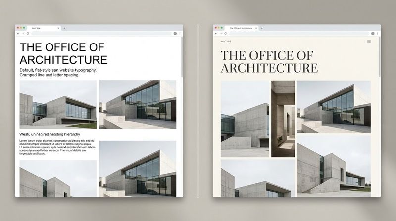
Arial, Roboto, Helvetica, and Open Sans dominate the budget web landscape. They are free, they ship with every browser, and they load instantly inside most website builders.
Their functional merits are genuine. They render consistently across devices and operating systems. For pure readability, they are perfectly adequate.
The difficulty lies in their ubiquity. When every site a visitor sees that day uses the same typeface, none of them stand out. Your page becomes part of an undifferentiated mass rather than a distinct brand experience.
If you work with a cheap website designer, expect default fonts unless you make a deliberate effort to change them. Commissioning custom typefaces requires purchasing licenses, preparing files, and writing additional CSS rules that exceed the scope of most budget agreements.
Your brand then inherits the visual anonymity that comes with using the same fonts as every other template-driven site on the internet.
What Premium Brands Understand About Type
Study the websites of companies that command premium pricing. Their layouts are almost always simpler than you would expect.
Copy is concise. Navigation is streamlined. Visual elements are carefully curated rather than accumulated. There is no excess clutter pulling attention away from the core message.
What communicates their elevated position is a combination of powerful imagery and distinctive typography. These two elements do the majority of the brand-building work on every page.
If professional photography is beyond your budget, stock images become your visual foundation. This places additional weight on your typeface, since the text is what visitors examine most closely and for the longest duration.
The emotional response to typography is rapid and largely unconscious. Within moments of landing on your page, the shapes and rhythms of your letters trigger associations that color every subsequent interaction.
Swapping a default typeface for one with genuine character does more than change a cosmetic detail. It reshapes the entire framework through which visitors evaluate your business.
The Minimal Investment That Maximizes Impact
You do not need access to an expansive type library. What you need is one quality display typeface. Nothing more.
Display typefaces are designed for prominent text: hero sections, section headings, and any content meant to dominate the visual hierarchy. Fontspring and MyFonts both offer extensive catalogs worth exploring.
Look for a sans-serif or serif that carries personality in its construction. Distinctive proportions, unique terminal shapes, or unusual geometric qualities all contribute to a typeface that feels deliberately chosen rather than randomly selected.
A commercial license covering the weights you need typically costs between $30 and $50. That single purchase creates a visual identity that separates your site from the overwhelming majority of pages built on free defaults.
The effect is immediate and unmistakable. Your headings acquire an authority and character that no pre-installed typeface can deliver. The site feels different because the most prominent element on every page is different.
Constructing a Cohesive Font System
Your premium display font should appear exclusively in large, prominent text. These typefaces are engineered for visual impact at scale. At paragraph sizes, their defining details lose clarity and become illegible.
For body copy, choose a free sans-serif optimized for screen reading. Inter is an outstanding selection. System UI provides a dependable, browser-native alternative.
The dynamic between an expressive heading font and a clean, quiet body font creates the perception of expense. One commands attention with confidence. The other communicates without strain or visual fatigue.
Two typefaces is your ceiling. Introducing a third or fourth font disrupts cohesion and makes the page feel disorganized. Restraint and discipline in font pairing are hallmarks of professional design work.
The Critical Role of Spacing
A premium typeface in poorly spaced text still reads as amateur. The space surrounding and separating your letters is not a secondary consideration. It is a fundamental component of typographic quality.
Body text needs a line height of approximately 1.5 to 1.6. This creates adequate separation between lines while preserving the natural rhythm of reading. Tighter leading produces a density that discourages continued engagement.
Headings benefit from subtle adjustments to letter spacing. A modest increase in tracking can noticeably enhance their appearance, adding a layer of polish that distinguishes intentional typography from platform defaults.
The size contrast between headings and body text must be decisive and unapologetic. A timid hierarchy communicates uncertainty about the design's own authority. Strong typography commits fully. Make your size differences dramatic.
Using Color to Support, Not Compete
A restrained color palette amplifies the impact of a well-chosen typeface. Many high-quality sites rely on narrow, near-monochrome schemes for exactly this reason.
Dark charcoal text on an off-white background delivers a sophisticated, comfortable reading experience. Pure black on pure white, by contrast, creates harsh contrast that fatigues the eyes during longer visits.
Interactive elements like links and buttons should be clearly identifiable from static content without dominating the visual hierarchy. A single, understated accent color is sufficient to guide user behavior.
When your typeface has genuine personality, color becomes a supporting element. The letterforms themselves sustain attention, making elaborate palettes unnecessary and potentially counterproductive.
Self-Hosting for Optimal Delivery
Purchasing the typeface is only the first step. Ensuring it loads quickly and reliably for every visitor is the second.
Self-host your font files rather than linking to an external service. This removes a third-party dependency from the critical loading path and gives you direct authority over timing and delivery.
Your purchase will include files in .woff and .woff2 formats. Place them in your server directory and declare them with a standard @font-face rule in your stylesheet.
A page that renders custom typography without delay communicates competence and reliability. A page that briefly displays unstyled text before the font loads communicates the opposite. Rendering speed and perceived polish are inseparable qualities.
Planning for Font Loading Failures
Font files can and do fail to load. Network interruptions, server timeouts, and file corruption are all realistic scenarios that your design must address.
Pair your primary typeface with a fallback that mirrors its classification. A geometric sans-serif should fall back to Arial or Helvetica. A serif should fall back to Georgia.
This ensures that even in a failure scenario, visitors encounter a clean and readable page. The specific character of the typography shifts, but the underlying professionalism holds firm.
Verify this behavior periodically. Block the custom font file using your browser's developer tools and reload the page. Confirm that the fallback maintains a composed, intentional appearance without the custom typeface present.
Advocating for Better Typography as a Client
Even when someone else is building your site, you retain significant influence over its visual quality. That influence requires initiative and clear communication.
When you compare affordable web design offerings, lean scopes are standard. Template-driven projects typically rely on whatever the platform provides out of the box, typefaces included.
Take ownership of this decision from the outset. Purchase a font license yourself and deliver the files to your developer. Request that they implement the typeface across all headings and select an appropriate body font for paragraphs.
Most builders welcome this level of specific creative direction. It eliminates guesswork and elevates what can be achieved within a constrained project scope. Your modest investment raises the quality ceiling of the entire build.
The Instant Perception Game
Visitors form a conclusion about your site before they read a single word. The visual texture of the typography plays a central role in this rapid, largely unconscious assessment.
Typefaces that appear across thousands of pages trigger associations of anonymity and low investment. Typefaces that feel distinctive and carefully chosen trigger associations of quality, care, and credibility.
This response has been conditioned through years of browsing behavior. We have learned to associate custom typography with brands that invest meaningfully in their presentation because historically, that association held true.
That connection now benefits anyone willing to make a targeted, modest investment. One typeface choice can position your site alongside brands with substantially larger budgets. The psychology behind the perception remains unchanged. Only the cost of access has dropped.
Conclusion
A professional aesthetic on a restricted budget comes down to knowing where your investment creates the most visible and lasting impression. Typography consistently ranks as the highest-leverage decision in web design.
One well-chosen typeface can conceal the simplicity of a basic layout, elevate the impact of stock imagery, and give your brand a visual voice that belongs exclusively to you. It touches every page and every first impression.
When you evaluate affordable web design for your next project, incorporate the cost of one quality display typeface into your initial plan. It is a minor line item that produces a major transformation.
Leave the platform defaults behind entirely. Choose a typeface with purpose, pair it with a clean body face, and implement it with precision. The difference your visitors perceive will be immediate, undeniable, and lasting.







Top comments (0)